REGEN10
A LOGO DESIGN FOR A REGENERATIVE FARMING NON-PROFIT
A LOGO DESIGN FOR A REGENERATIVE FARMING NON-PROFIT
2024
Regen10 is an organisation built up of many multistakeholder partnerships, with the shared aim of working with farmers to achieve regenerative food systems. With a long road ahead, and many stakeholders to represent, a strong and inclusive brand was crucial for their launch at COP.
Client
REGEN10
DELIVERABLES
LOGO DESIGN AND SYSTEM
AUDIENCE
GLOBAL STAKEHOLDERS
Role
LOGO DESIGNER AND ACCOUNT MANAGEMENT
Regen10 is an organisation built up of many multistakeholder partnerships, with the shared aim of working with farmers to achieve regenerative food systems. With a long road ahead, and many stakeholders to represent, a strong and inclusive brand was crucial for their launch at COP.
Year
2024
DELIVERABLES
LOGO DESIGN AND SYSTEM
AUDIENCE
GLOBAL STAKEHOLDERS
Role
designer AND ACCOUNT MANAGEMENT

LOGO DEVELOPMENT
LOGO DEVELOPMENT


CONCEPT
A mosaic of knowledge from different groups of people is a crucial factor in achieving Regen10's mission.
To represent Regen10's meticulous approach, the weight of the letterforms was reduced in the logo, which created more delicate and organic structures.
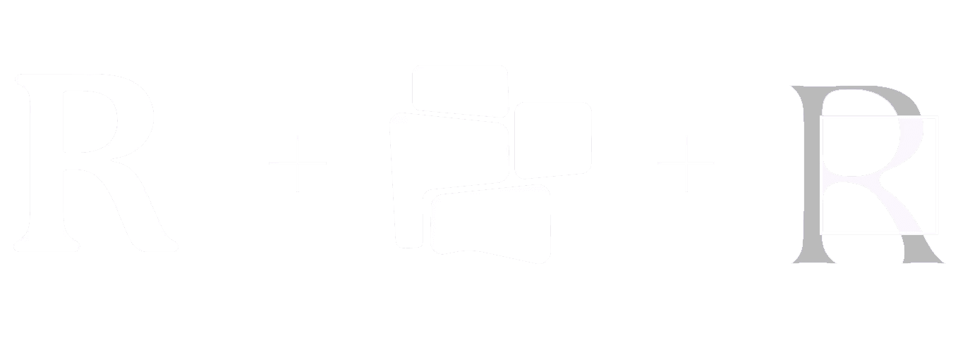
The "R" is boxed within a square, or piece of land, creating river-like shapes. This design represents Regen10's attempt to connect the dots with other initiatives and people, allowing information to flow together from multiple sources and representing Regen10's meta initiative.


A mosaic of knowledge from different groups of people is a crucial factor in achieving Regen10's mission.
To represent Regen10's meticulous approach, the weight of the letterforms was reduced in the logo, which created more delicate and organic structures.
The "R" is boxed within a square, or piece of land, creating river-like shapes. This design represents Regen10's attempt to connect the dots with other initiatives and people, allowing information to flow together from multiple sources and representing Regen10's meta initiative.
COLOUR
The colour palette uses tonal gradients to represent the gradual but thoughtful approach of Regen10, ensuring that the global societal needs are met and all communities are considered.
EXECUTION


The colour palette uses tonal gradients to represent the gradual but thoughtful approach of Regen10, ensuring that the global societal needs are met and all communities are considered.