


The
Guardian
An annual report to celebrate independent journalism
YEAR
2025
ROLE
EDITORIAL
DATA DESIGN
AUDIENCE
EMPLOYEES
READERS
The role of this report was to celebrate the Guardian's financial success and foster pride in its independence, which, in today's world, is a rarity in journalism. I was the sole designer on this project, involved in creating the full digital report, data designs, and collaborating with the authors and copywriters.
The
Guardian
The
Guardian
An annual report to celebrate independent journalism
YEAR
2025
ROLE
EDITORIAL AND
DATA DESIGN
AUDIENCE
EMPLOYEES AND GUARDIAN READERS
The role of this report was to celebrate the Guardian's financial success and foster pride in its independence, which, in today's world, is a rarity in journalism. I was the sole designer on this project, involved in creating the full digital report, data designs, and collaborating with the authors and copywriters.
Benchmarking and planning
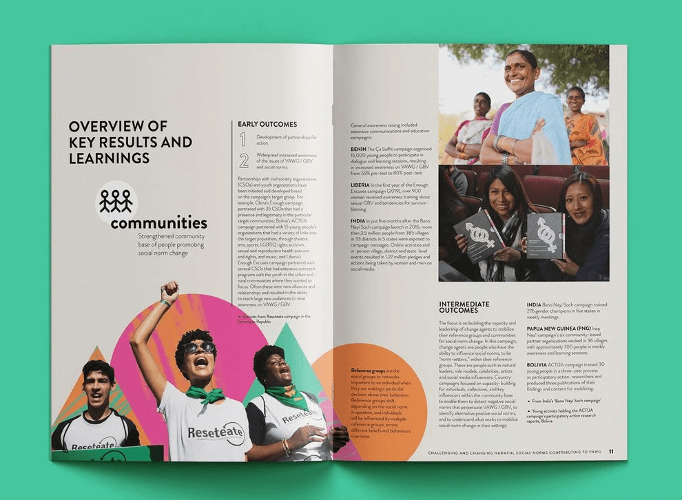
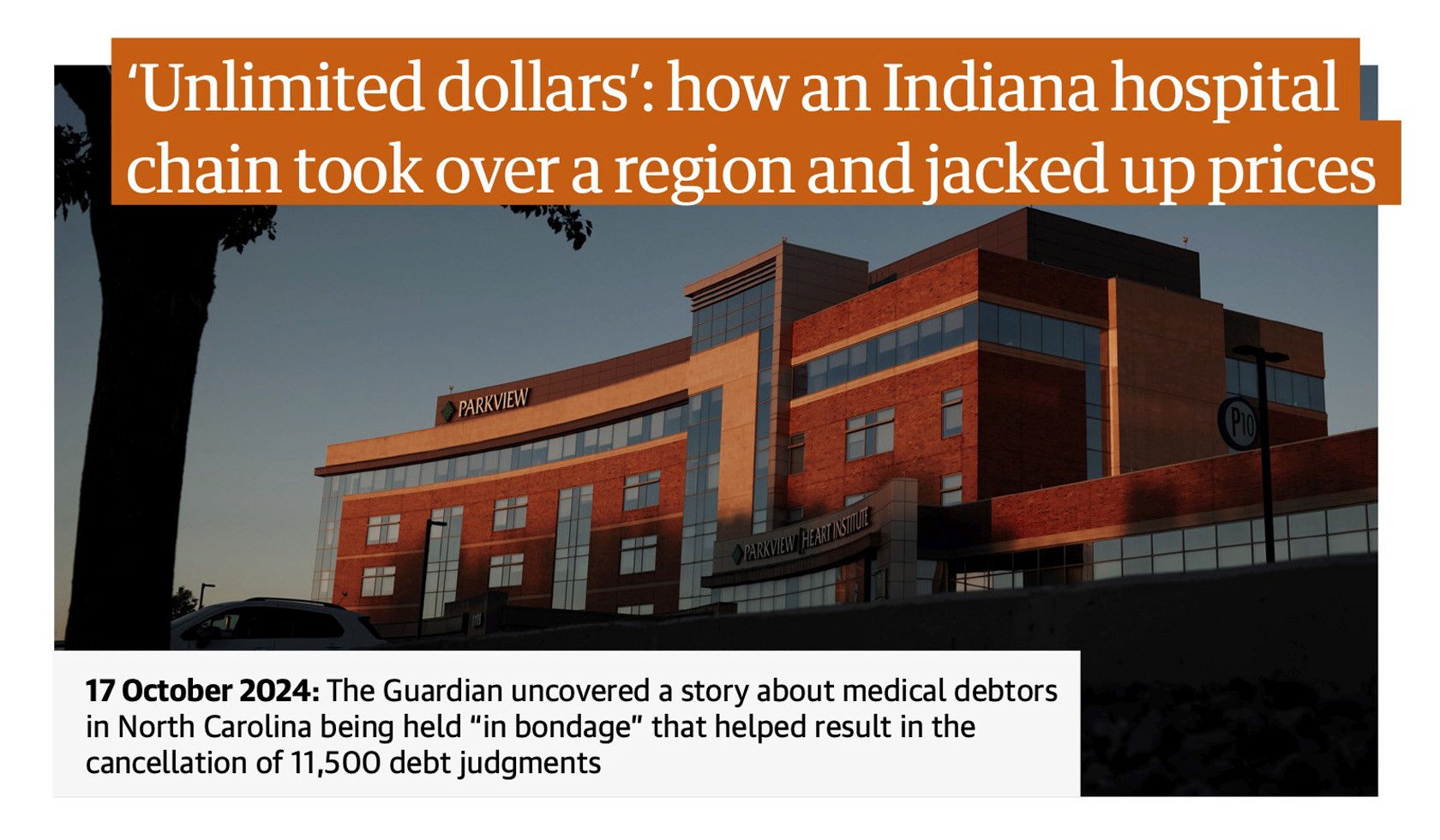
The report was to be built from a series of letters, key data points from the year, and hero sections for each region the Guardian covers. I advised authors to limit their letters to around 500 words. Resulting in a cohesive and confident report style.
From benchmarking to scamps, I decided layout consistency was key to ease the reader's eye. As well as colour and brand shapes to create visual consistency between the varying author topics.
Benchmarking and planning
The report was to be built from a series of letters, key data points from the year, and hero sections for each region the Guardian covers. I advised authors to limit their letters to around 500 words. Resulting in a cohesive and confident report style.
From benchmarking to scamps, I decided layout consistency was key to ease the reader's eye. As well as colour and brand shapes to create visual consistency between the varying author topics.


Translating the
iconic Guardian
Type
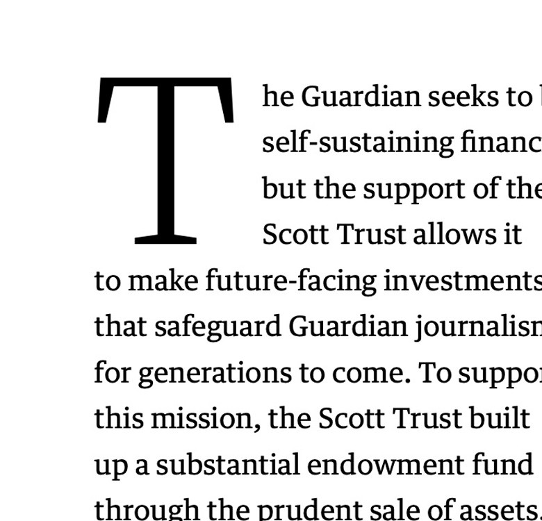
Treating the type as though it were a Guardian article, to give the report the look and feel of a piece of writing that is recognisable to the reader.
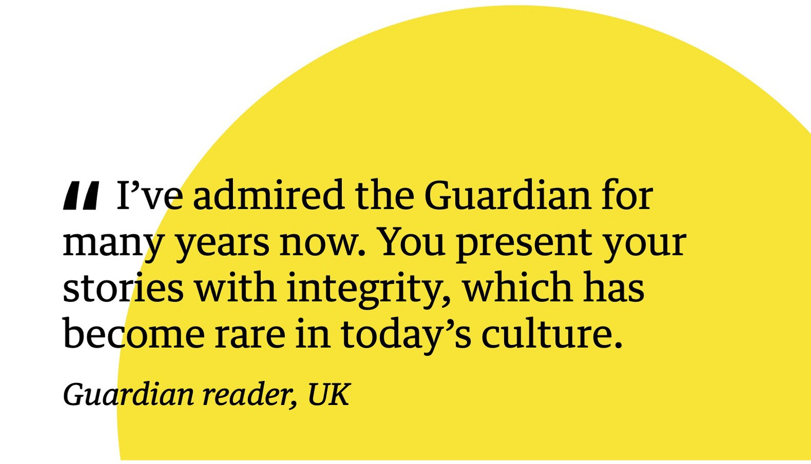
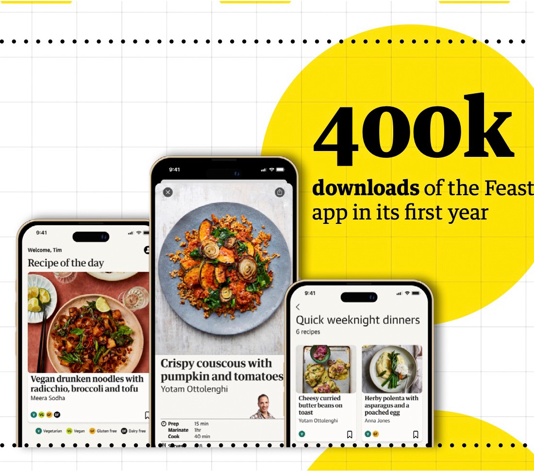
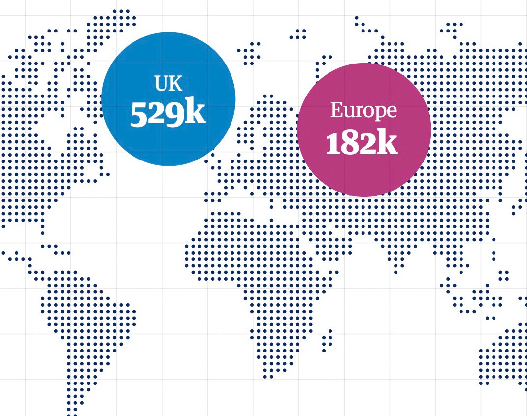
Colour
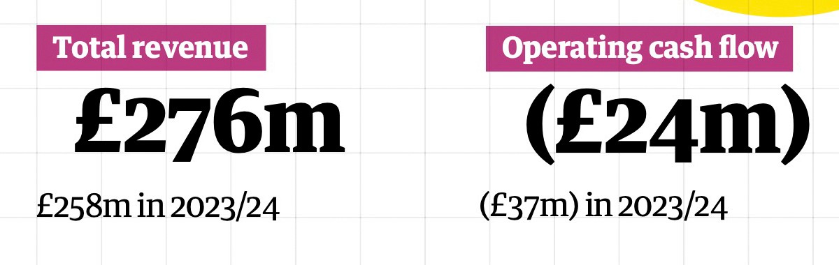
Using the Guardian's iconic yellow colour and circle brand shape to draw the eye to important information and data points.
Shapes
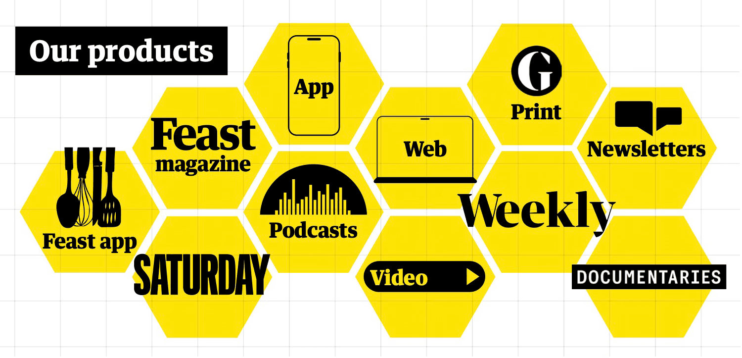
Representing their ever-expanding portfolio, use a bee's 'hive' of all their products as a nod to Manchester's symbol of a bee for their Mancunian routes.
Translating the
iconic Guardian
Type
Treating the type as though it were a Guardian article, to give the report the look and feel of a piece of writing that is recognisable to the reader.
Colour
Using the Guardian's iconic yellow colour and circle brand shape to draw the eye to important information and data points.
Shapes
Representing their ever-expanding portfolio, use a bee's 'hive' of all their products as a nod to Manchester's symbol of a bee for their Mancunian routes.
The full report


The full report
The
Guardian
An annual report to celebrate independent journalism
YEAR
2025
ROLE
EDITORIAL
DATA DESIGN
AUDIENCE
EMPLOYEES
READERS
Having long been an admirer of the Guardian’s editorial and UX design, I was thrilled to receive this brief from the Guardian to design their annual report. The role of the report was to celebrate the financial success of the Guardian, fostering pride in their independence, which, in todays world, is a rarity in journalism. I was the sole designer on this 4 week project, involved in creating the full digital report as well as the weekly client calls.
Benchmarking and planning
The report was to be built from a series of letters, key data points from the year, and hero sections for each region the Guardian covers. I advised authors to limit their letters to around 500 words. Resulting in a cohesive and confident report style.
From benchmarking to scamps, I decided layout consistency was key to ease the reader's eye. As well as colour and brand shapes to create visual consistency between the varying author topics.
Connect to Content
Add layers or components to swipe between.
Connect to Content
Add layers or components to swipe between.
The iconic Guardian style
Type
Treating the type as though it were a Guardian article, to give the report the look and feel of a piece of writing that is recognisable to the reader.
Colour
Using the Guardian's iconic yellow colour and circle brand shape to draw the eye to important information and data points.
Shapes
Representing their ever-expanding portfolio, use a bee's 'hive' of all their products as a nod to Manchester's symbol of a bee for their Mancunian routes.